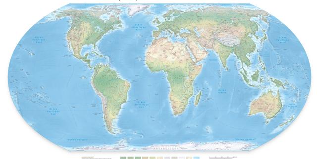
For nearly five centuries, humanity has stared at a flattened falsehood. When Gerardus Mercator drew his navigational grid in 1569, he solved a practical headache for sailors who needed to plot a straight compass course across a curved ocean. He never intended for his cylindrical projection to hang on classroom walls as an objective mirror of planetary reality. Yet, through an accident of colonial history and digital laziness, his 16th-century marine chart became the default mental image of the Earth.
The United Nations General Assembly recently voted to adopt a resolution backing a shift toward the Equal Earth projection, capping off years of intense diplomatic pressure led by African member states under banners like the #CorrectTheMap campaign. The vote yielded 164 countries in favor, a single dissenting vote from the United States, and a handful of abstentions.
This friction at Turtle Bay is not merely an academic quarrel over cartography. It exposes a deeper fracture over how visual authority shapes political weight. When the global machinery of education, governance, and technology relies on a map that visually reduces the African continent to a size roughly equivalent to Greenland—despite Africa actually possessing fourteen times more landmass—the implications extend far beyond ink and paper.
Flattening a three-dimensional sphere onto a flat surface forces mathematical compromises. You can preserve the accurate shapes of landmasses, or you can preserve their true relative sizes. You cannot do both.
Mercator chose to preserve angles. For a mariner trying to avoid running a galleon into a reef off the coast of Flanders, rhumb lines were everything. If a captain drew a straight line between two points on Mercator's chart, the ship would arrive safely by following that constant compass bearing.
The spatial tax for this navigational convenience is massive distortion at high latitudes. As you move away from the equator toward the poles, the scale expands exponentially. Greenland balloons outward until it matches an entire continent. North America and Europe swell into bloated landmasses that dominate the visual hierarchy of the northern hemisphere. Meanwhile, equatorial regions like South America, Southeast Asia, and Africa are compressed and minimized.
Let us consider a hypothetical example to illustrate this geometric betrayal. If you take a standard Mercator classroom map and drag the shape of Alaska down to the equator, it shrinks dramatically. On the map itself, Alaska appears roughly equal in size to Australia. In physical reality, Australia is four and a half times larger than Alaska.
This systematic inflation of northern latitudes creates a silent cognitive conditioning. Generations of students grow up associating physical dominance on a map with geopolitical importance. When dominant nations look twice the size of entire developing regions on every classroom wall and news graphic, the bias becomes invisible. It morphs into background radiation.
Diplomats and historians have pointed out that this cartographic imbalance mirrors historical power structures. The nations that drew and distributed the maps placed themselves at the center and scaled themselves upward. Critics occasionally label this phenomenon cartographic colonialism, noting that the map quietly reinforces a hierarchy where the global north appears vast and commanding, while the global south is physically minimized.
When French Foreign Minister Jean-Noël Barrot announced that France would drop the Mercator projection from its diplomatic uses and co-sponsor the UN resolution, he noted that changing a map does not instantly alter geopolitical realities. However, correcting a distorted representation serves as a basic act of truth.
That truth faces an uphill battle against code.
The primary reason Mercator survived the twentieth century is not because old school boards refused to buy new atlases. It survived because of Silicon Valley.
When Google, Apple, and open-source mapping pioneers built the modern internet's location infrastructure, they faced their own computational nightmares. Stitching millions of satellite tiles together into a smooth, zoomable interface required a mathematical shortcut. The Web Mercator projection became the undisputed standard for digital mapping because its square coordinates make programming tile algorithms remarkably simple.
Every time a smartphone user pulls up a ride-hailing app, checks a food delivery route, or scrolls through a weather radar, they are looking at Web Mercator. The projection treats the Earth as a perfect square rather than a sphere, stretching the poles infinitely and distorting sizes with abandon.
Tech companies have little structural incentive to rewrite their core rendering engines. Transitioning global digital infrastructure to an equal-area projection like Equal Earth or Eckert IV requires rewriting how geospatial data is indexed, stored, and displayed. It introduces rendering latency and breaks legacy software hooks. Convenience consistently wins over cartographic honesty.
When the United States delegation voted against the UN resolution, dismissing the debate over sixteenth-century maps as a superfluous distraction from genuine global crises, they spoke for an engineering and political establishment that prefers status quo efficiency. To a pragmatic technocrat, a map is just a utility function. If it gets you to a coffee shop or helps a missile find a coordinate, its mathematical biases are irrelevant.
Yet symbols carry weight precisely because people live inside them.
Maps guide education, shape cultural imagination, and form the foundational vocabulary of how humans understand their shared home. When a child traces a continent with a finger, the perceived scale sinks into memory.
The UN resolution carries no enforcement teeth. It cannot compel tech monopolies to re-architect their mapping APIs, nor can it force local school districts to throw out decades-old geography books overnight. What it does is fracture an unexamined consensus. It drags a hidden bias out into the open air where it can no longer hide behind technical jargon.
The lines drawn across our screens and paper atlases are human choices. Every projection tells a lie to tell a truth. Mercator lied about size to save sailors from rocks. For centuries after, that lie served the interests of those who wanted to look bigger than they were.
The geometry is shifting. The software will eventually follow, dragged kicking and screaming by the realization that a distorted world breeds distorted perspectives.